The Story of the Sleepy Panda: Designing the LazyDevLabs Logo
A brand isn't just a name, it's a feeling. Here's the winding road we took to find ours.
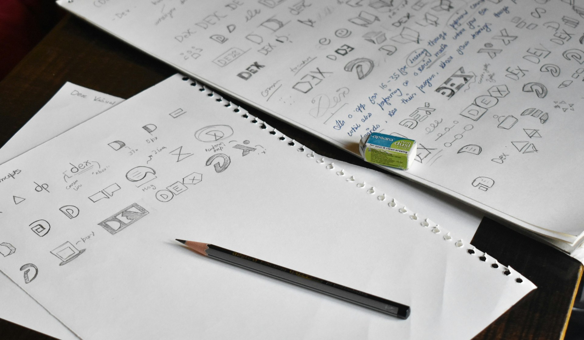
Photo by Onkar Mehta on Unsplash
Chapter 1: The Search for an Identity
When I first started LazyDevLabs, the name clicked immediately. It captured the philosophy I wanted to bring to my games: smart, efficient design that was easy and relaxing to engage with. But a name is only half the battle. It lacked a face, a visual identity that could communicate "lazy" in a positive way. I needed a symbol that felt relaxed and comfortable, yet also smart and intentional, not unmotivated.
I filled pages of a notebook with initial sketches. My first ideas were very literal. I played around with abstract symbols from the coding world, things like brackets, semicolons, and curly braces. I tried to combine them with classic laboratory imagery like gears and beakers to represent the "Labs" part of the name. While some of these were interesting graphically, they all felt cold and impersonal. They had no personality, no heart.
My next thought was to use the initials themselves. I spent a long time trying to form a clever face or symbol out of the letters L, D, and L. At one point, I had a concept that looked promising, until I realised the uncomfortable truth: it looked almost identical to the LG Electronics logo. It was a humbling and hilarious moment, but a clear sign that I had to go back to the drawing board. That path was a dead end.
Chapter 2: Calling in a Professional
After hitting a creative wall, I decided it was time to bring in a professional designer. I gathered my best sketches and my brand notes and hoped for a spark of outside genius. When the first drafts came back, however, my heart sank a little. The designer had provided very straightforward, technically proficient translations of my existing sketches. There was nothing new, nothing unique that they had brought to the table.
There was one logo in the batch that I did like. It involved a clever integration of coding characters into a mascot. It was well-executed, but it still didn't feel quite right. It was too technical, too focused on the "Dev" and not enough on the "Lazy." It didn't capture the relaxed, playful feeling that was at the core of the brand.
Chapter 3: An Epiphany Courtesy of a Kung Fu Master
Feeling a bit stuck, I took a break from the design process to relax and watch a movie. That movie was *Kung Fu Panda*. As I watched Po, it suddenly clicked. The panda was the perfect representation of the LazyDevLabs ethos. Pandas are masters of energy conservation. They are calm, thoughtful, and carry a sort of gentle strength. A sleepy panda perfectly captured the relaxed vibe I wanted for my games.
This was the breakthrough I needed. I immediately started researching logos that successfully incorporated animals, looking for inspiration on how to make a mascot feel both iconic and personal. I shared this new direction and a mood board of animal logos with the designer, feeling more excited and certain than I had in weeks.
Chapter 4: The Final Breakthrough
The next design that came back was a huge step in the right direction. It was a beautifully drawn panda, simple and friendly. But something was still missing. It was a great panda logo, but it could have been a logo for anything. It didn't feel uniquely "LazyDevLabs." It was missing that personal connection to the name.
That's when the two threads of the journey came together. I remembered my initial, failed attempt to make a logo from the initials. I looked at the new panda design and had the final idea. I sent a note back to the designer with one last suggestion: "What if we try to subtly work the initials, L-D-L, into the body of the panda itself?"
That suggestion was what finally brought the entire concept to life. The designer skillfully integrated the letters into the panda's face and body, creating the logo you see today. The sleepy expression, the soft curves, and the hidden initials all work together to create a welcoming, clever, and friendly mascot. It is a symbol of the studio's entire philosophy: simple on the outside, smart on the inside, and designed with a smile.
← Back to Blog